Cartier Tank
The Watch That Never Needed to Be Loud
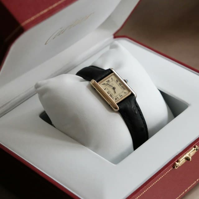
There is something almost improbable about the Cartier Tank. Its inspiration was a machine built for war. Its legacy is one of the most graceful objects ever worn on a wrist.
The watch does not shout. It does not need an oversized case, a complicated dial or the visible machinery of a small industrial plant to make its point. Two parallel lines, a rectangle, a few Roman numerals. More than a century after its creation, that is still enough.
Perhaps this is what makes the Tank so compelling. In an industry that often equates progress with addition, it remains an argument for knowing when to stop.
A war machine, seen differently
In 1917, Europe was deep in the First World War. Armoured vehicles had begun to change the appearance of the battlefield, and Louis Cartier found in their unfamiliar geometry the basis for a new kind of wristwatch.
The story is sometimes reduced to the claim that the Tank looks like a tank. It is more precise, and more interesting, than that. Seen from above, a military tank has a central body flanked by two continuous tracks. Cartier translated that arrangement into a watch: the dial and case form the centre; the two elongated sidebars, known as brancards, suggest the tracks. The strap meets those bars in a way that makes the entire object read as a single composition.
It is a remarkable act of abstraction. Cartier did not make a miniature battlefield souvenir. He extracted a few lines from a brutal machine and turned them into something intimate, civilised and elegant.
The first Tank design dates to 1917, and the watch reached the market in 1919. Its arrival was radical not because no one had ever made a non-round watch, but because the shape felt so resolved. A rectangle was no longer a novelty imposed upon a watch movement. It became the governing idea of the whole object.
A century later, the construction still makes sense at a glance. The case does not merely hold the dial. It frames it, extends it and gives it a posture.
The discipline of a few lines
Look closely at a traditional Tank and the apparent simplicity becomes more deliberate.
The Roman numerals give the dial a formal, almost architectural rhythm. The railway-style minute track introduces precision without making the face feel technical. Blue hands provide a small flash of colour; the cabochon-set crown adds an almost jewellery-like detail at the edge. None of these elements is especially loud on its own. Together, they make a watch that is unmistakably Cartier even from across a table.
The brancards are the real achievement. They give the watch its identity, but also soften the transition from case to strap. Where a round watch often sits on the wrist as a separate object, a Tank can seem to belong to the line of the arm.
That is why dimensions matter so much. A Tank is not simply a rectangle that can be enlarged indefinitely. Its elegance depends on the relationship between length, width, dial and wrist. Change the proportions and you change its character.
This is also why the watch photographs differently from how it wears. In a product photograph, its geometry may appear almost severe. On the wrist, the same geometry becomes surprisingly gentle.
A watch for people who did not need to prove they had one
Few watches have moved so comfortably between worlds.
The Tank has been associated with artists, actors, public figures and royalty, not always for the same reasons. Rudolph Valentino famously wore a Tank in the 1921 film The Sheik, even though the watch was out of place in the story's historical setting. It was a wonderfully revealing choice: style mattered more than continuity.
Andy Warhol's attachment to the Tank has become part of watchmaking folklore. For Warhol, the appeal was less about the practical necessity of knowing the hour than about the object itself. It was something to wear because of what it was, not simply what it did.
Then there is Princess Diana. Photographs show her wearing a Tank Louis Cartier on a leather strap and, later, a gold Tank Française. The distinction matters: these were different interpretations of the same design language, not the exact same watch. In both, the Tank complemented rather than competed with her clothes. It could be refined without appearing fragile, recognisable without demanding attention.
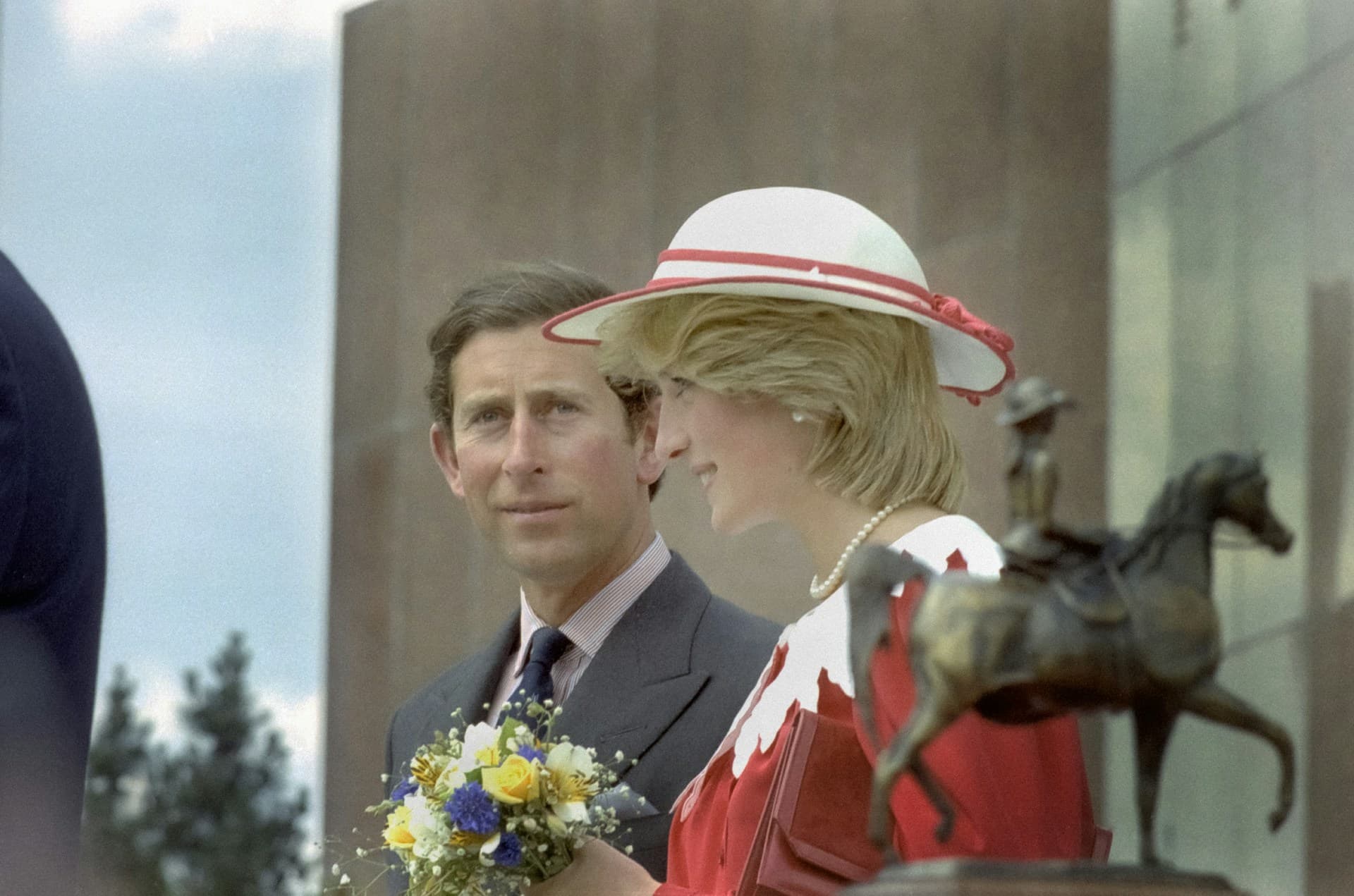
What unites these very different wearers is not a single social class or aesthetic. The Tank can look at home with a suit, an open shirt or something more theatrical. It has been worn by men and women without needing to be redesigned as an entirely different idea for either.
A Submariner may evoke adventure, competence or achievement. A Tank suggests something less easily advertised: an ease with one's own taste.
Of course, a Cartier is still a luxury object. Its name carries wealth, history and recognition. Quietness should not be confused with anonymity. The Tank signals status too. It simply does so in a different register.
One idea, many Tanks
Calling the Tank a single watch is a little like calling a chair a single design. The original concept has generated a family of interpretations, each changing the emphasis while preserving something recognisable.
The early Tank Normale established the essential architecture. The Tank Louis Cartier refined it into the softer, balanced silhouette many people now picture when they hear the name. The long, curved Tank Cintrée made the rectangle more expressive and elongated.
Later models brought the Tank into different decades. The Must de Cartier line made the design available in more accessible forms, including versions with unconventional dial colours. The Tank Américaine stretched and curved the case into a more assertive shape. The Tank Française, introduced in 1996, integrated a metal bracelet into the geometry so convincingly that the watch can feel closer to a piece of jewellery than a conventional dress watch.
The Tank Solo offered a comparatively restrained entry into the family. Its XL Automatic version introduced a larger case and self-winding movement into a design more often associated with smaller, manually wound or quartz-powered watches. In common steel configurations, the Solo XL Automatic measures roughly 31 by 41 millimetres and uses Cartier's calibre 049, with a date display. It is a practical, distinctly contemporary interpretation, though its larger size naturally changes the delicacy of the classic Tank proportions.
There is no single correct Tank. Someone who loves the intimate dimensions of a vintage Louis Cartier may find an XL too assertive. Someone accustomed to modern watches may find the smaller models almost startling at first. That tension is part of the collection's appeal: the same design can feel radically different with a few millimetres added or removed.
The peculiar comfort of restraint
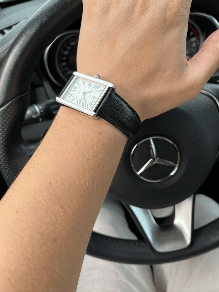
The Tank's attraction is not only visual. It is physical.
Having worn a number of fine watches, I find the Tank Solo XL Automatic among the most comfortable. There is a calmness to it on the wrist, a sense that nothing needs to be added or explained. Its shape feels considered rather than imposing. It is elegance in its purest form.
That is a personal experience, not a promise that every Tank will suit every wrist. Comfort depends on case size, strap, bracelet and the wearer. Yet it helps explain why the design inspires such loyalty. A watch can be beautifully made and still ask you to remain conscious of its presence. The Tank often does the opposite.
It is a luxury object that can make the act of wearing luxury feel unusually uncomplicated.
There is something satisfying about that. No rotating bezel to fiddle with. No elaborate set of subdials. No suggestion that the wearer must be ready to dive, race or navigate an aircraft. The Tank simply occupies its place.
In a world full of objects engineered to capture attention, that can feel almost radical.
What, exactly, are you paying for?
It would be too easy to romanticise the Tank without asking the obvious question: does its price reflect its watchmaking?
Sometimes, yes, in part. Cartier has produced Tanks with serious mechanical movements and sophisticated complications, and the craftsmanship of particular cases, dials and finishes deserves attention. But the Tank family also includes relatively straightforward quartz watches and automatic movements that are not intended to compete with the most technically ambitious movements in Swiss watchmaking.
A Tank is therefore not always the strongest purchase if judged by movement specifications alone. A buyer interested primarily in accuracy, power reserve, water resistance or mechanical complexity may find more for the money elsewhere.
Even the details of daily use require honesty. A polished case can show marks. Leather straps are consumable. Water resistance varies by model and should not be treated as an invitation to swim. The rectangular shape, however graceful, will not flatter every wrist equally. And Cartier's name inevitably accounts for part of the price.
But it would be equally misleading to assess the Tank as though design were merely decoration around a movement. The shape is the achievement. The continuity of that shape, and the extraordinary cultural life it has acquired, are part of what the buyer is purchasing.
The important distinction is between paying for a story that has been manufactured by marketing and paying for a design that has genuinely survived history. The Tank has a strong claim to the latter.
That does not make every version good value, nor every asking price sensible. It means the right questions are broader than the movement's specification sheet.

The courage not to change
Fashion is very good at persuading us that what we loved yesterday is inadequate today. Watches are no exception. Cases grow, shrink and grow again. Dials become busier, then cleaner. Materials and finishes are reinvented as necessities.
The Tank has participated in those changes, but it has never completely surrendered to them. A Tank from another decade may look different in scale or detail, yet its basic grammar remains recognisable.
That continuity is rare. It requires confidence from a manufacturer and a particular kind of confidence from the wearer.
A Tank does not imply that its owner has discovered the newest thing. Quite the opposite. It suggests that novelty may not be the point.
There is a reason an old Tank can still look contemporary, and a new Tank can seem to have a past. Its design belongs neither entirely to yesterday nor entirely to today. It has escaped the calendar more successfully than most objects that tell time.
And perhaps the greatest irony is still the first one. A silhouette borrowed from a machine designed to advance through mud and destruction became an enduring symbol of composure.
The Cartier Tank has changed countless times without abandoning itself. It has been worn by people who wanted to be noticed and people who did not. It can be jewellery, an heirloom, a daily companion or a small declaration of taste.
But at its best, it is something simpler.
A watch that knows exactly what it is.
And never needed to be loud.
Sources & Further Reading
- Cartier — Tank collection
- Fondation de la Haute Horlogerie — Tank
- Sotheby’s — Collecting the Cartier Tank
- Sotheby’s — The Essential Guide to the Cartier Tank
- British Vogue — The Story Behind Princess Diana (And Meghan Markle’s) Favourite Cartier Watch
- Filipucci — Cartier Tank Solo XL Automatic W5200027 / 3515